doing good better by william macaskill
Life

Effective Altruism and The 100x Multiplier

I’m reading William MacAskill’s “Doing Good Better,” and it’s motivated me to automate monthly donations to the most effective charities I can. In the past I’d set up automated donations, but when moving to Maui, moving costs, job changes, and higher costs of living required me to suspend them. For me, MacAskill’s book about Effective Altruism has served as the reminder we all occasionally need, and my hope is that this post will serve as the reminder for others.

MacAskill writes of “The 100x Multiplier”, which is the idea that as citizens of the most economically developed societies, our resources can do 100 times more good for the poorest on earth than they can do for ourselves. In other words, the amount of benefit the poorest in the world would derive from $1 is about the same I would derive from $100. This is a very powerful idea, especially considering how insanely easy it is to donate to some of the most effective charities in the world, regularly and automatically.

GiveWell.org does thorough research on which charities are most effective in doing good. I just went to this link: https://secure.givewell.org/donate-online, and set up a recurring monthly donation to Deworm The World and GiveDirectly. I timed it on my phone, it took 1:36.29 (1 min 36 sec). That includes me looking around for my wallet and my autofill settings putting in the wrong address.

The amount we each can give varies, but almost anyone reading this blog can afford to set up something that will automatically come from their bank account, and they likely won’t even notice. It’s easy to get caught up in our day to day lives and forget about the extraordinary position we’re in the help those who were born into much poorer economic circumstances. This is why it’s so important to automate these types of donation decisions, to make giving the default, and when our economic circumstances change, we can dial back donations if need be. But we should always keep in mind that what seems like a little for us, can make a huge difference for others.

Standard
wordpress plugin boilerplate home page
JumpOff, programming, web development, wordpress plugin development

Using WordPress Plugin Boilerplate

In working on my first WordPress Plugin, I’ve come across The WordPress Plugin Boilerplate, which is an object oriented starter codebase for writing WordPress plugins. I’d recommend using this generator to get started, as it’ll go ahead and properly name the files and methods with the name of your plugin.

Converting my prototype to work within the structure of the WPPB has been a bit of a challenge. It’s required me to think a little differently, but should keep things more organized as JumpOff grows. You can see the progress on my GitHub Repo.

Here’s one of the first issues I ran into:

The styling of JumpOff’s admin page requires making an edit to the default styles of the WordPress Admin Area. I needed to change the background color of the admin area wrapper:

#wpwrap {
	background-color: #222;
}

ul#adminmenu a.wp-has-current-submenu:after, ul#adminmenu>li.current>a.current:after {
	border-right-color: #222;
}

In doing so, I noticed it was applying these color changes to the whole admin area, no matter what page I was on. Hooking a plugin’s admin CSS to the ‘admin_enqueue_scripts’ hook is a bad idea in my case, but it’s also inefficient in many other cases. If you’re styling a plugin’s options page, hooking it to ‘admin_enqueue_scripts” will load it on ANY WordPress admin page. Assuming you’re properly namespacing with your CSS, this may not be a problem, but ideally, you’d only load the CSS on the pages that need it.

With WPPB, this CSS loading happens with this line:

$this->loader->add_action( 'admin_enqueue_scripts', $plugin_admin, 'enqueue_styles' );

So I had to use a different hook, called only on a plugin’s options page. This turns out to be a little difficult within the structure of WPPB. Ultimately what I’m doing is adding this action in the “class-{plugin-name}.php” file’s “define_admin_hooks()” function:

//Load conditional CSS just on JumpOff page
$hook_suffix = 'toplevel_page_jumpoff';
$this->loader->add_action( 'admin_print_scripts-' . $hook_suffix, $plugin_admin, 'jo_page_enqueue_styles');

Now, ideally $hook_suffix, would be dynamically generated by the action that adds the options page:

//Main Menu Item
$this->hook_suffix = add_menu_page( 'JumpOff Options', 
	'JumpOff',
	'manage_options',
	'jumpoff',
	array($this, 'jumpoff_show_page'),
	'dashicons-edit',
	'6'
);

But, in keeping with WPPB’s OOP structure, this is run inside the “{plugin-name}_Admin” class, while the action enqueueing the styles has to be run from the “{plugin-name}” class. Even though I’m setting an instance variable in the “{plugin-name}_Admin” class, this isn’t done until the “admin_menu” hook fires, so my code in the “define_admin_hooks” doesn’t have access to the “$hook_suffix”.

I tried adding another action at the end of the “admin_menu” hook to get the hook suffix after it existed, then add the action with the proper hook name, but that didn’t work either. So then I hard-coded the “$hook_suffix” to make the hook “admin_print_scripts-toplevel_page_jumpoff”, which is fired only when the JumpOff admin options page is loaded.

That worked, but wasn’t very DRY. Then I realized that when “define_admin_hooks()” instantiated the “{plugin-name}_Admin” object, it passed in the plugin name as a parameter:

$plugin_admin = new Jumpoff_Admin( $this->get_plugin_name(), $this->get_version() );

So, I went into my function declaring the admin menu, and  made the code use that plugin name as it was passed in:

//Main Menu Item
add_menu_page( 
	'JumpOff Options', 
	'JumpOff',
	'manage_options',
	$this->plugin_name,
	array($this, 'jumpoff_show_page'),
	'dashicons-edit',
	'6'
);

Then I changed the admin_print_scripts conditional loading action to this:

//Load conditional CSS just on JumpOff page
$this->loader->add_action( 'admin_print_scripts-toplevel_page_' . $this->get_plugin_name(), $plugin_admin, 'jo_page_enqueue_styles');

Now the add_menu action and the admin_print_scripts-{hook_suffix} action are both relying on the plugin name defined in the plugin’s constructor. A little more DRY.

Any ideas for how to improve this? Email me (jesse (at) jessequinnlee.com)!

Standard
active art, arduino, art, human computer interaction, programming, Throw, web development

Active Art Project, “Throw”

I’ve recently started on an art project that’s going to combine 4 of my absolute favorite activities, creating digital art, web-development, construction, and throwing balls at things. I’m so excited about this idea!

This project has been in the planning/research stages for a while, but I’m still very early on, and I want to write about the project and the process as it progresses here.

What is it?

There are several ways I could answer that, let me start with how one will use it.

You’ll start off holding a tennis ball, standing 10 – 60 feet away from a plywood board with a frame around it. On this board, you’ll notice an 8×8 grid of 4″ squares painted on it. An LED light will shine from one of these squares, and you’ll be instructed to hit that square with the tennis ball.

You’ll throw the ball, and a monitor, or nearby tablet will blink and give you a score, showing you where you were supposed to hit and where you hit. There will be two grids on this screen, grid one will show a color plotted on the square you were supposed to hit, and grid two will show the same color plotted wherever you actually hit.

After repeating this process 63 times. You’ll end up with a final accuracy score and two grids, one will be the source image you were (unknowingly) attempting to recreate, and the second will be your recreation. Theoretically, if one had perfect aim, the two would be exactly the same.

These two images will be automatically uploaded to a web-app where they will be added to two larger images. Image 1 gets placed, like a puzzle piece among other source images, to ultimately create the larger original source image from which it came. Image 2 (the recreation attempt) gets placed, similarly among the other recreation attempts created by the throwers before you, to ultimately create a collective recreation attempt of the larger original image.

How does it work?

Well, that’s where it gets interesting.

Basically, how the board will work, is that a couple inches off the board’s surface, built into the surrounding frame, there will be 2 arrays of 36 light sources (laser diodes (or LEDs), arranged along the X and Y axes of the board (72 total). Directly across the board from each of these, will be a corresponding light sensors (phototransistors or photoresistors). This will create a grid of beams, all connected to an Arduino Uno microcontroller.

When an object passes through this beam grid, it will temporarily block some of the beams. By monitoring which beams are blocked on both the x and y axes, the Arduino & computer it’s connected to, will determine (approximately) where the ball hit the board, and feed this information into the web-app. Voila!

So I know how to build the web-app, how to build the wooden frame, and definitely how to throw tennis balls at things, but electronic hardware, well, that’s not my strong suit. Hence, me joining Maui Makers and learning about Arduinos. People on the Arduino forums have also been very helpful, if you’re interested, check out the Arduino forum thread where I’m getting help.

I’ve sketched out basic diagrams of how this will work, and have started researching the exact hardware I’ll need to make it happen. The more I research and talk to people about the idea, the less simple it seems. I’m realizing making this theoretical idea a physical reality is quite a bit more complicated than I initially thought. But luckily, every time I talk to people we come up with even more potential applications for a sensor board like this.

Once the hardware is built, the applications are seemingly endless. here are just a few that have come up.

  • Use it to play Battleship. But no calling ‘A4’, you just try to hit a spot with the ball, and wherever you hit, that’s where you hit.
  • Use it as an instrument, block different beams to play different notes.
  • Use it for pitching practice, to track accuracy.
  • Use it to draw/paint by dragging your hand through the beam grid. Or you could choose a color on a tablet, then throw a ball to plot that color wherever you hit on a grid.
  • If other people built these sensor boards, we could have people all over the world throwing at boards and contributing to the same images, or playing Battleship remotely.
  • Group throwers by skill level or age, and have them recreate the same source images. How does that affect the fidelity of the recreations?
  • People could take photos of themselves with a phone, then that photo could become the image they’re recreating by throwing at the board.

The possibilities are endless. And beautifully, it’s a way to be ACTIVE while interacting with computers and creating art.


Standard
brainstorm, human computer interaction, ux design

Brainstorm on Physically Active Computer Interfaces

*Apologies for the scattered, incomplete nature of this post, this was really a brainstorming exercise, but I figured, why can’t it be public brainstorming? So here goes:


Problems:

I feel much better physically when working a service job that requires movement, but I’m interested in working on computers. I can feel the physical/mental toll for spending too much time in front of a screen. Sitting all day is terrible for your posture and physical fitness. On days when I’m off work and do a lot of walking and moving, it’s amazing how much better I feel.

Traditional keyboard/mouse input is outdated and limited.


Solution:

As we spend more time interacting with computers, we should find ways to be physically healthy while we do it.


We need a shift in paradigm for general consumer computer interfaces. More intuitive interfaces built to capitalize on how our bodies/brains evolved to function best. Instead of cramping our hands moving a mouse around a tiny square of desk to draw things, we should be swinging our whole arm around.

There are tons of ways we could be interacting with computers, we’ve barely scratched the surface. O


Thoughts:

Room with projection on wall, or oculus rift VR viewing.

Pick up and move physical blocks to change windows or programs.

Exercise taxes to de-incentivize unwanted behavior (push-ups to open Facebook, burpees to open Netflix, etc).

Associate different tasks with different areas of space and movements, helping to improve memory by activating more areas of the brain to connect with ideas and tasks. (cite spatial memory techniques discussed by Ed Cooke in Tim Ferriss Show #52).

Background colors, music or imagery changes for context switches, ie, when you want to program there are peripheral backgrounds of mountains or something, then when you want to email you switch to backgrounds of cityscapes or something.

Soundscapes or music could change as well. An example of this idea already in use is workout music. When I workout or run, I’ll often listen to intense music about overcoming hardship or toughness (2pac, Talib Kweli, Wale, even, embarrassingly, Eminem) which serves as emotional motivation to push myself harder. Or I’ll use upbeat electronic music to put myself into a trance to disassociate from physical pain when pushing hard. We could program our environments/interfaces to change throughout the day based on what tasks we’re trying to do.

Punching bags or something to close programs?


Questions:

How could users network, manipulate others’ environments, share?

Would productivity due to speed loss (if you had to move something physical to perform a task, rather than just click something) be outweighed by overall productivity, happiness and longevity caused by better health, more focus, less distractions, stronger mental associations?

What could be a small-scope initial application for a test? X-Box Kinect to control some interface?

Standard
jumpoff wordpress plugin logo
JumpOff, programming, web development, wordpress plugin development

My First WordPress Plugin

I’m happy to announce I’m in the process of writing my first ‘real’ WordPress plugin. Sure I’ve written a few before, but they were all kind of auxiliary plugins, designed primarily to solve a custom problem on a particular website or theme. I’ve never written a plugin that adds functionality intended to be used by everyday users.

It’s called JumpOff, and it’s be a tool for writers and bloggers to get into a state of flow. It’s designed to limit your options so you just focus on stream-of-consciousness writing. The goal is to explore your thoughts and get them from your head to the page without second-guessing, backtracking, or editing.

Here’s a sneak peek screenshot of where it’s at so far. It doesn’t look like much, but that’s the point, most of the interesting stuff is happening under the hood. The basic idea is working, but it’s still in the prototype stages. Once it’s ready for beta release it will be an open-sourced, free plugin. I’m looking forward to writing here about the process of designing, coding and releasing my first WordPress plugin!

jumpoff screenshot

Standard
North shore view from the lanai
maui

Move to Haiku

I can’t believe it’s been over a year since I made the move up the hill to this split-level house in Makawao:


Interior pano makawao


And my lofted bed surrounded by windows overlooking goat-filled pastures:


Makawao bed

I’ve always wanted to live in the mountains. To be able to do it and be 15 minutes from beautiful beaches and world class surf breaks is pretty incredible.

But it’s time to move on down the road a bit to Haiku. I’ve taken a room on a property full of friends, and for the first time since moving to Maui, I can see the ocean from my place. There’s something really special about enjoying your morning coffee, hearing the wind rustle through the palms and staring North toward the vastness of the Pacific. Here’s my new morning view:


North shore view from the lanai


Standard
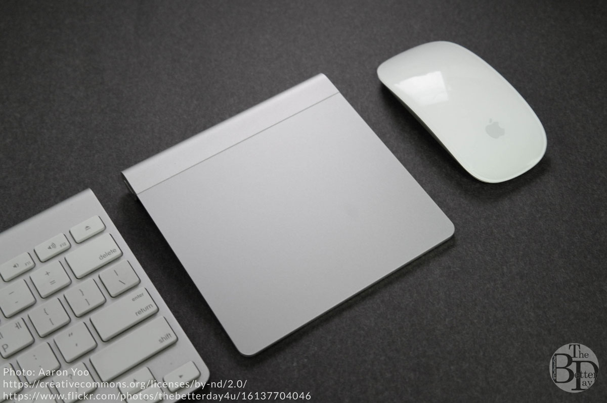
natural scrolling on the apple magic mouse and trackpad
human computer interaction, ux design

Natural Scrolling Vs. Reverse Scrolling

Occasionally, when using someone else’s laptop, I swipe my fingers up or down the trackpad to “scroll” a page up or down, and to my surprise, it move the opposite way I expect it to. It’s because a few years ago I switched to Natural Scrolling. For those that don’t know, here’s the difference between the two:

Reverse: Swipe fingers up on trackpad, magic mouse, scroll-wheel, content goes down, scrollbar goes up.

Natural: Swipe fingers up on trackpad, magic mouse, scroll-wheel, content goes up, scrollbar goes down.

Many people are used to reverse scrolling, because when scroll wheels were introduced to mice, they were linked to the indicator in the scroll bar, which controlled the viewport on a page.

In 2011, when Apple made natural the default mode in OSX Lion, I thought it was purely a matter of preference and I was already used to reverse scrolling so I opted to stick with reverse. But while experimenting with different types of workstations, I got to thinking about the concepts of the two types of scrolling, and suddenly it dawned on me that I WAS WRONG!

Natural scrolling is flat out better than reverse scrolling, and here’s why.

Firstly, I find the concept of scrolling itself a little problematic. I like to think of moving the content itself, rather than scrolling a page. The scrollbar on the screen is merely an indicator of the position of our viewport. But our screen/viewport is almost always stationary relative to us. So if it’s not moving around, why are we pushing it? Instead we should be pushing the content, itself, which does move (virtually, anyway).

In the physical world, stuff usually moves when you push it, that’s what our brains expect. And it’s my belief that interfaces should be as intuitive as possible to free up our cognitive capacity for more important tasks than navigating space (like creativity, expression & critical thinking). With natural scrolling, when you push up on a trackpad, the content moves up. If you lay a piece of paper on your desk, and push up (forward) on it with two fingers, which way would it move?

What really drove this concept home for me was when I was experimenting with a standing desk with a monitor down low by my keyboard and mouse, angled up at me. In effect, mimicking a table touch screen computer (minus the touch-screen functionality). The trackpad and screen were on the same plane, which helped me link the the virtual spatial plane we navigate on a computer, and how our input devices (mouse/trackpad/tablets) interact with it.

Natural scrolling on computers is nothing new, it’s how touch screens already work, you push stuff in the direction you want it to go. Having reverse scrolling on a touch screen would feel totally unnatural. We should be doing the same thing with our mouses and trackpads, that we do with our phones and tablets.

Even on non-touch devices, many interfaces have panning tools, which work in the way we’d expect, you grab and push or pull content in the direction you want it to go. Reverse scrolling works in the exact opposite way of these tools, while natural scrolling uses the same intuitive concepts.

Instead of moving a scrollbar/viewport, which adds another conceptual layer, inconsistent with our actual viewport (the screen), we should be moving the content itself.

You may think, “Well I’m already used to reverse scrolling, it’s not worth it to change,” and while depending on your situation, I can’t conclusively say that it is, I can say it seems likely that the reduced cognitive load from using a unified navigational framework across devices will be well worth the small amount of frustration it takes to retrain your brain to go “natural.” Personally, it took me about two days at work to become totally used to natural. In those two days I probably spent about 5 minutes combined re-scrolling pages I’d accidentally scrolled the wrong way.

You can decide for yourself whether it’s worth it to switch (if you haven’t already), but I suspect it is, especially since natural is the way of the future anyway.

Standard
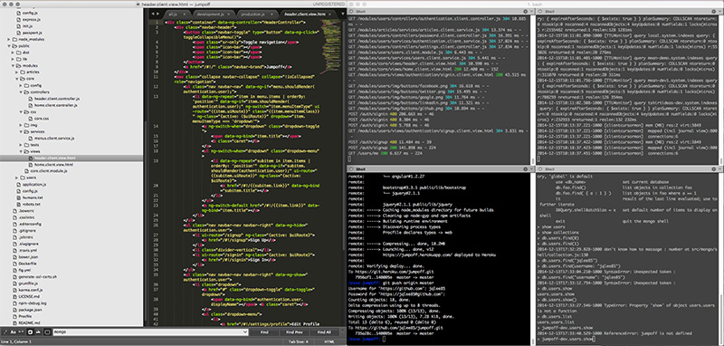
sublime text 3 and iterm showing meanjs app
meanjs, web development

Launching a Mean.js App

After experimenting with Rails for building web apps, I’ve decided to learn to build apps using the MEAN.js stack. Very quickly, the MEAN stack is comprised of:

  • Mongo DB: A no-sql, JSON document based database.
  • Express: Backend framework for Node apps written in Javascript
  • Angular: Frontend javascript framework
  • NodeJS: A single-threaded, non-blocking javascript web-server running on Google’s V8 engine

So the MEAN stack allows you to write web apps completely using Javascript (as well as html/css of course). Apart from these 4 basic technologies, MeanJS integrates packages like Bower and Grunt.

I like the elegance of Ruby and Rails, but seeing as how apps seem to be moving toward using javascript heavily for front-end frameworks, I’d rather learn to code on the backend using Node and Javascript so I don’t have to switch contexts between Ruby and Javascript. Also, the non-blocking async nature of Node means that it has the potential to be very fast. Node’s got a lot of hype around it and seems to be growing quickly, so if I’m gonna invest my time in learning a technology, it seems like a good one.

I’ve already noticed that launching/tweaking a MEANjs app is more complicated than a Rails app, and there is less support out there, learning resources aren’t as prevalent or polished, although I’ve found a few good ones. Here’s what I’m using so far, apart from the official Framework docs, constant Googling and StackOverflow:

  • MEAN Stack Intro – (Video) Good, 1 hr demo/overview on how the technologies interact to form an app.
  • 30 Day Mean Stack Honolulu Challenge – (Video) 30-ish videos around 10-15 minutes each, showing how to launch a basic MEAN app. Great explanation, also goes over Bootstrap for front end styling. I highly recommend this series if you’re looking to put a little more time in. By Bossable.com.
  • Web Development with Node and Express – (Book) Good explanation of Node and Express, doesn’t include angular, and uses Mustache for backend templating, while MEAN.js uses Swig (sparingly). It also covers concerns regarding deployment and maintenance. When I’m burned out from being on the computer all day, it’s nice to supplement the training by reading this (one of these days I’ll get a life, I swear).

I’m using Heroku for cloud hosting, and MongoLabs for my online database. Heroku seems to offer pretty good support for Node apps, though admittedly I don’t really have anything to compare it to.

As far as the actual purpose of the app I’m building, I’ll write more on that in a different post as I progress, but I’ve already got a working test app up on Heroku and linked to the .io domain I purchased for it. It’s coming along!

Standard
Mystery Cube Photograph by Jesse Quinn Lee
graphic design, maui, photography, photoshop

Mystery on Maui


It’s been a while since I’ve posted here. A lot’s been going on. I moved up to Makawao and got two new jobs. I’m doing design work for Hawaii Web Group, and photo/web work for Creative Island Visions Wedding Photography. I’m very excited to be working for small businesses run by people I like, and I split my time between design, coding and photography, which is fantastic. I get to indulge my creative and technical sides and I’m constantly learning. I actually got paid to photoshop THIS and I recently redid the website and handled WordPress and email migrations for Creative Island Visions. Between the jobs, surfing, ultimate-frisbee, dodgeball, yoga and learning guitar, I’ve been pretty maxed out, but I’m trying to find time to do some of my own photography and design when I can. Here’s a piece I did tonight from a photo I took near Waikapu last weekend.
Mystery Cube Photograph by Jesse Quinn Lee

Standard